
Getting email pop-ups right
Pop-ups don't annoy people. Bad pop-ups do. Here's how to build one visitors are glad to see.
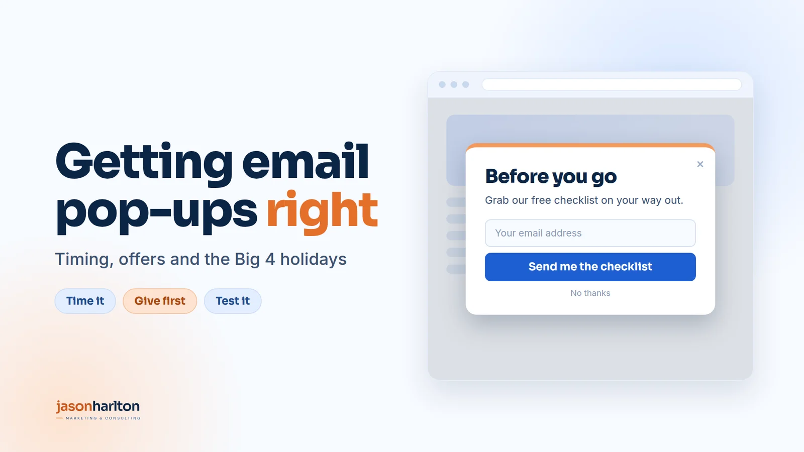
I commented on a post about website pop-ups recently, and the replies split into two camps. One said pop-ups are the most annoying thing on the internet. The other said they're one of the best ways to grow an email list.
Both are right. The difference is how the pop-up is set up.
A pop-up that covers the page the moment you arrive, asks for your email in exchange for "updates", and comes back on every page is annoying. A pop-up that appears when you're ready, offers something you actually want and leaves you alone once you've said no is useful.
This article covers how to build the second kind: what a pop-up is for, when to show it, what to offer, how to test it, and how to plan it around the four biggest shopping moments of the year.
What a pop-up is for
Most people won't buy on their first visit to your website. They're comparing, researching or just not ready yet. If they leave without a way for you to follow up, most of them won't come back.
A pop-up's job is to turn that visit into a conversation. It gives the visitor a reason to share their email, so you can stay in touch until they're ready to buy.
That makes it a bridge between two stages: someone discovering you and someone buying from you. Your ads, posts and search traffic bring people to the site. The pop-up catches the ones who aren't ready yet. Your emails then bring them back.
Seen that way, the question isn't "Should we use a pop-up?" It's "Are we giving people a good reason to stay in touch?"
The 95:5 rule: most visitors aren't ready yet
There's research behind the idea that most visitors aren't ready to buy. LinkedIn's B2B Institute and Professor John Dawes of the Ehrenberg-Bass Institute call it the 95:5 rule: "95% of your potential buyers aren't ready to buy today" (LinkedIn B2B Institute). They'll come into the market at some point, but not yet. The same research found that 75% of companies buy computers only once every four years, and that even in consumer markets, 90% of people buy a new car only every ten years.
The research is about B2B, but the logic applies to most websites. On any given day, only a small share of your visitors are ready to buy. The rest are learning, comparing or just curious.
That changes what a pop-up should do:
-
Most pop-ups only speak to the 5%. "10% off your first order" works for someone ready to buy today. It means very little to someone who won't buy for six months.
-
The bigger opportunity is the 95%. A pop-up that offers something useful now, such as a guide, a checklist or a planning tool, lets you stay in touch with people who aren't ready yet. When they are ready, you're the business they remember.
-
You need both. Use your exit-intent pop-up on pricing and product pages for the 5% who are close to buying. Use your scroll-depth pop-up on blogs and guides for the 95% who are still learning.
As the B2B Institute puts it, "the brand that gets remembered is the brand that gets bought" (Marketing Week). An email list is one of the simplest ways to be remembered.
Timing: why "when" matters as much as "what"
The most common mistake is showing the pop-up as soon as the page loads. It's like a salesperson stopping you at the door before you've had a chance to look around.
Google makes the same point. Its search guidance warns that intrusive pop-ups "may frustrate" users and "erode their trust in your website", and recommends small banners instead of full-page overlays (Google Search Central). When Google tested its own full-page app pop-up on Google+, 69% of visits to that page were abandoned. After replacing it with a small banner, daily active users on the mobile site rose 17% (Google Search Central Blog).
So the goal is to show the pop-up when the visitor is most likely to welcome it. Two triggers do that well.
Exit intent: the last chance
How it works: on a computer, the pop-up appears when the mouse moves quickly towards the top of the browser, where people close the tab, type a new address or press back.
Why it works:
-
It doesn't interrupt. The visitor has finished reading or browsing.
-
You have nothing to lose. They were leaving anyway, so every sign-up is a gain.
-
It can answer the reason they're leaving. People leave a product or pricing page because they aren't ready, they're comparing options or the price gives them pause. The pop-up can speak to that directly:
- "Not ready yet? Email this to yourself so you can come back to it."
- "Get 10% off your first order."
- "Order by Friday for delivery before Mother's Day."
Best for: product pages, the cart, pricing pages and service pages, where people are making a decision.
On mobile: there's no mouse, so most pop-up tools use other signals, such as a fast scroll back up the page, pressing back or switching tabs. On phones, a small banner at the bottom of the screen usually works better than a full pop-up.
Scroll depth: proof of interest
How it works: the pop-up appears once someone has scrolled a set share of the page, usually about halfway.
Why it works:
-
Scrolling shows interest. Someone who reads half a blog post cares about the topic. Someone who leaves after two seconds doesn't.
-
The offer can match what they're reading. Halfway through "How to plan your Black Friday", a pop-up offering a Black Friday checklist feels like the next step, not an ad.
-
It filters out people who aren't interested, so the people who see it are the ones worth talking to.
Setting the depth: start at 50%. At 10% to 20% you're interrupting again. At 90% almost nobody sees it. Test between 40% and 70%. On short pages, use time on page instead, 30 seconds or more.
Best for: blog posts, guides and long service pages.
Matching the trigger to the page
Blog post or guide
-
Trigger: scroll depth, at about 50%
-
Offer: a checklist, template or guide on the same topic
Product page or cart
-
Trigger: exit intent
-
Offer: a first-order discount, free shipping or "save for later"
Pricing or service page
-
Trigger: exit intent
-
Offer: a short guide, a free audit or a case study
Homepage
-
Trigger: time on page, 30 seconds or more
-
Offer: your strongest general offer
Two rules apply everywhere. Show each person the pop-up no more than about once a week, and never show it to people who have already signed up or bought.
The offer: why someone gives you their email
A visitor gives you their email when what they get feels worth more than what they give up. What they give up is their email address and the risk of getting spam.
"Subscribe to our newsletter" fails that test. It promises more email and nothing else.
Give first: the reciprocity instinct
Psychologist Robert Cialdini, author of Influence, describes reciprocity as "the rule that obliges us to repay what another person has given us". He calls it "among the most widely documented norms in human societies" (Cialdini).
One famous example: when the Disabled American Veterans charity sent a standard donation request, about 18% of people gave. When the same mailing included a small free gift of personalised address labels, the response almost doubled, to 35% (Cialdini, via Brock University).
Most pop-ups get this backwards. They ask first ("Give us your email") and give later, if at all. A pop-up built on reciprocity gives first, then asks.
Here's how that shapes the design:
-
Show the value before the form. Lead with what they get: a preview of the checklist, the first tip, a picture of the guide. The email field comes second.
-
Give something away with no form at all. A useful tip in the pop-up itself, a free calculator, or a quiz that shows the result on screen, followed by "Want the full report? We'll email it to you."
-
Make it feel personal. Cialdini's advice is that a gift works best when it's "meaningful, tailored and unexpected" (ASU W. P. Carey School). A checklist that matches the page someone is reading feels made for them. A generic e-book doesn't.
-
Don't guilt people for saying no. Close buttons like "No thanks, I don't like saving money" feel like a trick, and reciprocity doesn't work on tricks. As Cialdini put it, "favors are to be met with favors; it does not require that tricks be met with favors" (Influence: Science and Practice). A simple "No thanks" keeps the goodwill.
-
Keep giving after the sign-up. The first few emails should keep the balance in the visitor's favour, with useful ideas, answers and examples, before you ask for a sale.
With that in mind, a strong offer does four things.
1. It solves their next problem. Ask what someone on this page is trying to do next. A person reading about how to choose a supplier wants a comparison checklist, not your newsletter.
2. It's specific. "The 12-point Black Friday checklist" beats "free marketing tips". Specific offers feel concrete, useful and quick.
3. It's instant. A download, a code or a quiz result straight away. "We'll be in touch" feels like a sales call.
4. It's easy. Ask for an email address only, or a name and email at most. Every extra field costs you sign-ups.
Offers that work, by type of business
-
Online shop: a first-order discount, free shipping, early access to a sale or a gift guide
-
B2B service: a checklist, a scorecard, a short audit or a "here's how we'd fix it" review
-
Local service: a seasonal booking reminder, a price guide or a "what to ask before you hire" checklist
-
Software: a template, a calculator or an extended trial
Offers that don't work
-
"Join our newsletter."
-
A long e-book nobody asked for.
-
A discount on every visit, which teaches people to wait for a deal before they buy.
Write the headline as the result
The headline matters as much as the offer. Say what the visitor gets, not what they have to do.
-
"Plan your Black Friday in 20 minutes" beats "Download our guide".
-
"Never miss the Mother's Day delivery cut-off" beats "Join our list".
The sign-up is only the start
Send what you promised right away. Then follow up with two or three helpful emails that build trust before you ask for the sale. Those emails turn the address into a customer.
Choosing the right pop-up for your business
There's no single best pop-up. The right one depends on how your customers buy. Six questions will point you in the right direction.
1. How long does it take your customers to decide?
-
A quick decision, like a coffee subscription or a T-shirt, suits a discount or free shipping.
-
A long decision, like a new supplier, a software system or a renovation, suits a guide, checklist, case study or audit. A discount won't speed up a six-month decision.
2. How often do they buy?
-
Repeat buyers are worth more over time. Early access, a loyalty perk or a "first to know" list keeps them coming back.
-
One-off buyers need trust more than a deal. Proof, guides and reviews work better.
3. Where do your visitors land?
-
Check the most visited landing pages in your analytics.
-
If most traffic lands on blog posts, start with a scroll-depth pop-up offering something related to the post.
-
If most traffic lands on product or service pages, start with exit intent.
4. Are your visitors mainly on phones or computers?
-
If most use phones, start with a small bottom banner or a slide-in, and keep the form to one field.
-
On computers, a centred pop-up with exit intent has more room to work.
5. What do customers ask before they buy?
-
Look at the questions your sales team or inbox hear most often.
-
The best offer often answers one of them, for example "What should I ask before I hire a contractor?" or "Which size do I need?"
6. Can you follow up?
-
A pop-up only pays off if someone sends the emails afterwards.
-
If you can't yet send a short welcome series, start with something simple, like a discount code or one useful download, and build from there.
The main pop-up formats
-
Centred pop-up: the classic box in the middle of the screen. Best on computers, with exit intent or scroll depth.
-
Slide-in: a smaller box that slides in from the corner. Less intrusive, and good for blog posts.
-
Bottom banner: a slim bar at the bottom of the screen. Best for phones, and the format Google recommends over full-page overlays.
-
Two-step pop-up: a button or link on the page ("Get the checklist") that opens the form when clicked. Because the visitor asked for it, it rarely annoys anyone.
-
Quiz or calculator: gives a result first, then offers to email the details. The strongest use of give first, and a good fit for services and higher-priced products.
-
Spin-to-win and other games: can work for fun consumer brands, but usually feels out of place for B2B or premium brands.
Putting it together
-
Online shop, quick decisions, mostly mobile: a bottom banner with a first-order discount or free shipping, plus a centred exit-intent pop-up on computers.
-
B2B service, long decisions, blog traffic: a scroll-depth slide-in offering a checklist on the same topic, plus an exit-intent pop-up on the services page offering a short audit or guide.
-
Local service, seasonal demand: a two-step pop-up offering a "book before the rush" reminder, switched on a few weeks before the busy season.
-
Higher-priced product or service: a quiz or calculator that gives a useful result first, then offers the full details by email.
Start with one pop-up on your highest-traffic pages, get it working, then add a second for the other group of visitors.
Testing: small changes, real results
A pop-up isn't something you set once and forget. Small changes can make a big difference, but only if you test them properly.
- Change one thing at a time. The offer, the headline, the trigger or the timing. If you change three things at once, you won't know which one made the difference.
- Give it enough visitors. A test that runs for two days on a quiet site tells you very little. Let each version run until it has had a fair number of views before you decide.
- Judge by sales, not sign-ups. A free gift might get five times the sign-ups of a checklist, but if none of those people buy, it isn't the winner. 100 people who buy beat 500 who never open an email.
- Check the rest of the site. If people start leaving the site faster after a new pop-up goes live, it's costing you more than it brings in.
A good order to test in: start with the offer, then the headline, then the trigger, then the design. The offer usually makes the biggest difference.
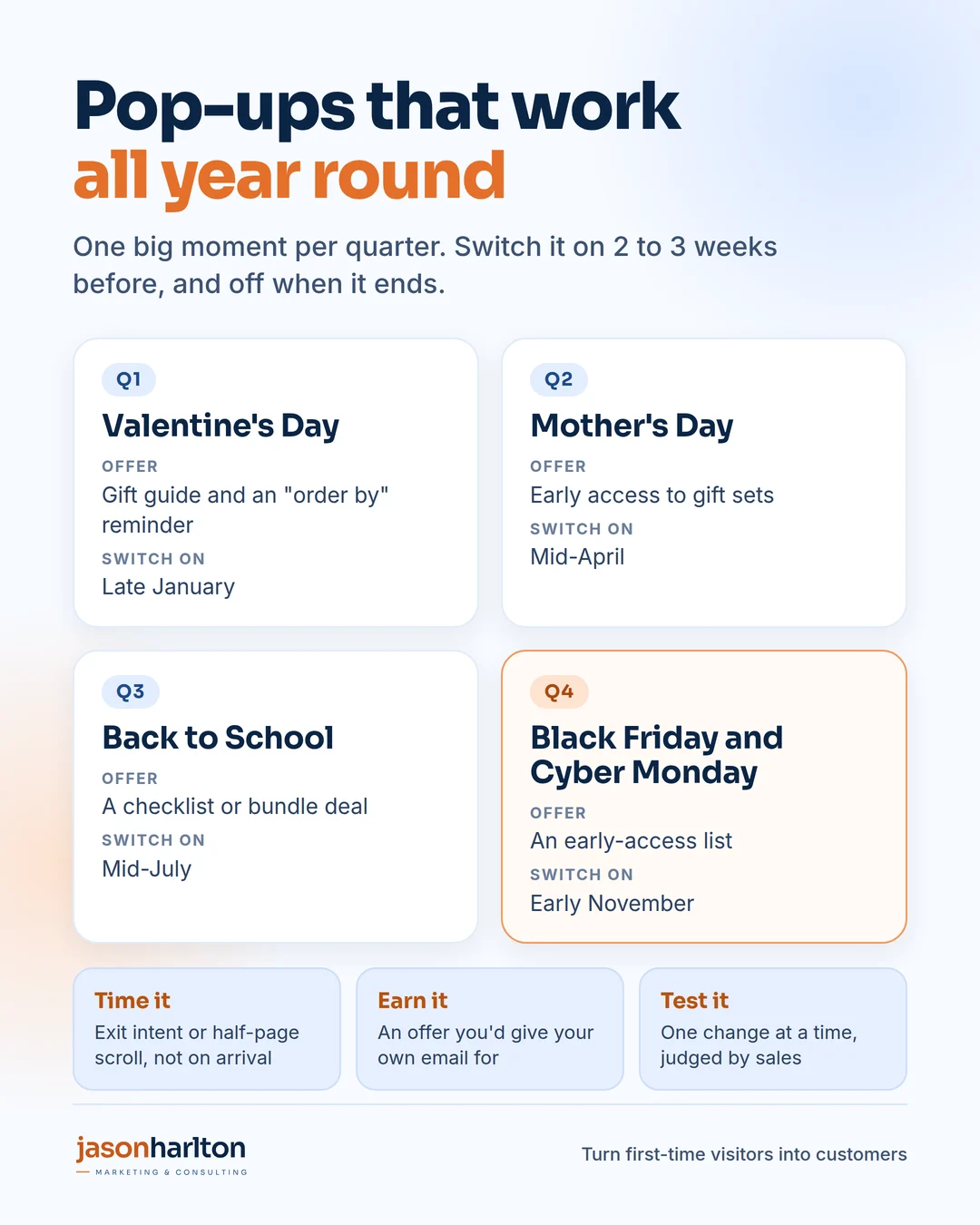
Holidays: the Big 4
If you sell in North America, four moments stand out, one in each quarter. Each one gives your pop-up a timely reason to exist.
Q1: Valentine's Day. Offer a gift guide or an "order by" reminder. Switch it on in late January.
Q2: Mother's Day. Offer early access to gift sets or a curated shortlist. Switch it on in mid-April.
Q3: Back to School. Offer a checklist or a bundle deal. Switch it on in mid-July.
Q4: Black Friday and Cyber Monday. Offer a place on an early-access list, so subscribers see the deals first. Switch it on in early November.
A few habits make holiday pop-ups work:
-
Start 2 to 3 weeks early. People plan and compare before the day. Your list needs to be built before the sale starts.
-
Use exit intent for deadlines. "Order by Thursday for delivery before Sunday" is one of the most useful messages you can show someone who's about to leave.
-
Switch it off when it's over. Nothing looks worse than a Valentine's offer in March. Put the end date in your calendar the day you switch it on.
-
Use what you learn. Each holiday tells you which offers and headlines your audience responds to. Use that for the next quarter.
Bringing it together
A good pop-up comes down to three things:
-
Time it. Use exit intent or scroll depth, not the moment someone arrives.
-
Give first. Offer something you'd give your own email for, and remember that most visitors aren't ready to buy yet.
-
Test it. Change one thing at a time and judge the results by sales.
Do that, and a pop-up stops being an interruption. It becomes one of the cheapest ways to turn first-time visitors into customers.
Sources
- LinkedIn B2B Institute, "95-5 Rule": business.linkedin.com
- Peter Weinberg and Jon Lombardo, "The 95:5 rule is the new 60:40 rule", Marketing Week: www.marketingweek.com
- Cialdini, "Reciprocity": cialdini.com
- Robert Cialdini, "Harnessing the Science of Persuasion" (Disabled American Veterans example), via Brock University: spartan.ac.brocku.ca
- ASU W. P. Carey School, "The gentle science of persuasion, part two: Reciprocity": news.wpcarey.asu.edu
- Robert Cialdini, Influence: Science and Practice (summary notes): www.influenceatwork.com
- Google Search Central, "Avoid intrusive interstitials and dialogs": developers.google.com
- Google Search Central Blog, "Google+: A case study on App Download Interstitials": developers.google.com